Case
Studies
A selection of brand identity and visual system projects developed from concept to completion. Each project focuses on building cohesive brand identities through logo design, typography, color systems and visual language that help the respective brands communicate clearly and consistently.


Cannes Lions
Competition
Creative Campaign Concept
Project Overview

The Brief is a global creative competition organized by Cannes Lions that invites creatives from around the world to collaborate and respond to a live challenge presented by a nonprofit organization.
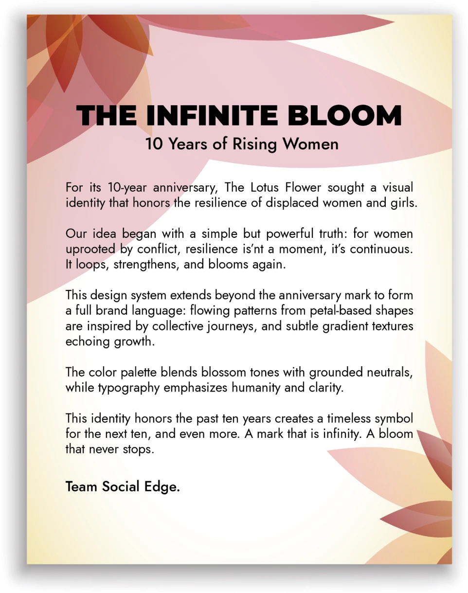
The 2025 challenge focused on The Lotus Flower, a charity dedicated to supporting displaced women and girls, celebrating its 10-year anniversary. The project involved developing a creative campaign concept and supporting visual identity for The Lotus Flower that could raise awareness, celebrate the organization’s impact and communicate its mission to a global audience.
The Challenge
The task was to create a compelling concept that raises awareness, inspire support & highlight experiences and resilience of women and girls affected by displacement while encouraging audiences to engage with the charity’s mission.
The Creative Idea
The creative direction focused on storytelling and symbolism to highlight resilience and continuity. The visual approach aimed to communicate impact while remaining respectful and empowering to the stories behind the cause.


Identity System
The idea was presented through a short visual storytelling concept. The submission included a logo mark, brand guideline motion graphics and social media campaign posters.
The logo featured an infinity symbol embedded within the number 10, representing both the charity’s anniversary and its ongoing impact. The color palette combined maroon, grey, black, and white to create a bold but respectful visual tone.
The campaign concept demonstrates how creative storytelling can be used to raise awareness and mobilize support for humanitarian causes.


Outcome
This concept explores how creativity & storytelling can bring global attention to the experiences of displaced women & girls while supporting a mission.

Samarah
Digital
Brand Identity Development
Project Overview

Samarah Digital is a digital skills and innovation platform focused on empowering individuals & organizations with modern technology knowledge, practical training and opportunities in the evolving digital economy.
The project involved developing a strong brand identity capable of positioning Samarah Digital as a credible and forward-thinking training platform. The identity needed to reflect innovation, growth and professional development as the organization aims to bridge the digital skills gap by providing accessible learning & upskilling experiences and programs that equip participants with relevant digital competencies.
The Challenge
The brand required a professional visual identity that reflected innovation, learning and empowerment while remaining accessible to a diverse audience of learners and professionals.
The Creative Idea
The design direction focused on clarity and modernity, positioning the brand as forward-thinking and technology-driven. The identity aimed to balance corporate credibility with an energetic and optimistic tone.


Identity System
The identity includes a distinctive logo system supported by blue and orange brand colors that communicate trust and innovation. A sharp, bold typographic system reinforces the brand’s digital and professional positioning, supported by a consistent visual style for marketing and educational materials.


Outcome
The final identity provides Samarah Digital with a modern & professional visual foundation that supports its training programs, marketing & communication.

Social Edge Group
Brand Identity & Visual System
Project Overview

Social Edge is a creative and digital marketing agency that offers services including branding, digital marketing strategy, social media management and creative content production among other creative services.
The project focused on building a brand identity that reflects the agency’s role as a bridge between ideas and communication. The visual system needed to communicate creativity, strategy, and professionalism while supporting the agency’s marketing materials, digital presence, and client-facing content. The agency focuses on helping brands transform ideas into impactful campaigns that connect with audiences across digital platforms.
The Challenge
The brand required a strong identity capable of positioning the agency as both creative and strategic within a competitive digital marketing landscape.
The Creative Idea
The visual direction focused on transformation and communication, reflecting how the agency helps brands turn ideas and messages into impactful marketing campaigns.


Identity System
The logo features a message icon within another shape, symbolizing the transformation of a message from an individual or brand into a wider audience conversation. The identity uses dark maroon and deep yellow, supported by bold typography and a clean visual system suitable for marketing materials and digital campaigns.


Outcome
The resulting identity positions Social Edge as a modern and creative agency with a clear, recognizable visual presence across branding and communications.

Mixsolo Lounge
Night Club Brand Identity
Project Overview

Mixsolo Lounge is a nightlife and lifestyle brand centered around social experiences, music, entertainment & vibrant nightlife culture. The lounge aims to create an energetic and welcoming environment where guests enjoy music, drinks & memorable social gatherings.
The project involved developing a brand identity that captures the excitement and atmosphere of nightlife while maintaining a recognizable and stylish visual presence. The identity needed to work across event promotions, social media marketing, and in-venue branding materials.
The Challenge
The challenge was to develop a brand identity that reflects the energetic and stylish atmosphere of a nightlife venue while maintaining a premium and recognizable visual style.
The Creative Idea
The visual direction focused on expressive typography and bold nightlife-inspired visuals that capture the energy of social gatherings and music-driven experiences.


Identity System
The logo incorporates cocktail glasses combined with night-light inspired elements, reinforcing the lounge’s social and nightlife atmosphere. The color palette of dark green, neon green, and pale yellow creates a vibrant visual identity suited for event promotion and nightlife branding.


Outcome
The identity presents Mixsolo Lounge as a lively and modern entertainment destination with a distinctive nightlife aesthetic.

OnespaceMall
E-Commerce Brand Identity
Project Overview

The project involved developing a modern brand identity that communicates trust, convenience and simplicity in the e-commerce space. The visual system needed to support the platform’s digital interface, marketing campaigns and brand communication across online channels as a platform designed to connect customers with authentic and verified products through a streamlined online shopping experience.
The Challenge
The brand required a modern identity that communicates trust, accessibility and simplicity, while standing out in the competitive e-commerce space.
The Creative Idea
The visual direction emphasized minimalism and clarity to reflect a seamless digital shopping experience with clean typography & simplistic design.


Identity System
The identity uses a minimalist and bold design approach with a strong red, black and white color palette. Clean typography and simple graphic elements reinforce the platform’s focus on authenticity and straightforward online shopping.


Outcome
The final identity establishes OnespaceMall as a modern and trustworthy digital marketplace with a clear and recognizable visual presence.

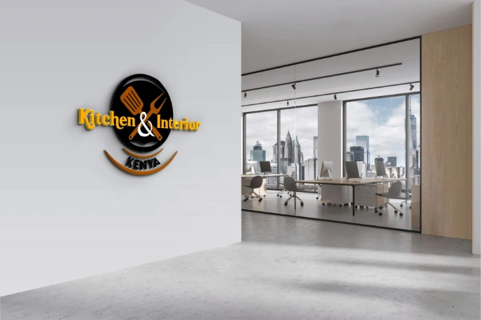
Kitchen & Interior Kenya
Retail & Interior Brand Identity
Project Overview

The project focused on creating a brand identity that reflects both functionality and interior elegance. The visual system needed to represent the brand as a reliable source for quality home products while appealing to customers interested in stylish and well-designed interior spaces that enhance modern living spaces.
The Challenge
The brand required a visual identity capable of representing both home interior design and retail product offerings while maintaining a professional and stylish look.
The Creative Idea
The visual direction focused on modern interior aesthetics, positioning the brand as a reliable provider of quality kitchen and home decor products.


Identity System
The identity uses a black, white, light grey and gold color palette to communicate sophistication and modern interior style. Clean typography and minimal graphic elements support the brand’s focus on home elegance and functional design products.


Outcome
The resulting identity presents Kitchen & Interior Kenya as a stylish and dependable brand for interior décor and kitchen solutions.

FixMate
Automotive Services Brand Identity
Project Overview

The project focused on building a brand identity that communicates reliability, efficiency and modern mobility solutions. The identity needed to reflect both the practical nature of automotive services and the technology-driven convenience of a digital platform. The platform aims to simplify car ownership by providing a centralized solution for locating trusted automotive services.
The Challenge
The brand needed an identity that communicates ease of access to reliability, convenience and smart mobility solutions for modern drivers.
The Creative Idea
The visual strategy focused on clarity and accessibility, positioning the platform as a practical and trustworthy solution for everyday automotive needs.


Identity System
The identity includes a bold logo system supported by a strong orange, dark green, black, and white color palette. Clean typography and structured graphic elements help communicate efficiency, access and technology.


Outcome
The resulting identity positions FixMate as a modern and dependable automotive platform designed to simplify car ownership and vehicle services.

Ruthex Travels
Travel Brand Identity
Project Overview

The project involved building a brand identity capable of communicating both adventure and reliability. The visual system needed to support travel promotions, destination marketing, and digital campaigns while presenting the company as a trustworthy travel partner for explorers and tourists.
The Challenge
The brand required a visual identity that communicates exploration, trust, and adventure, while remaining modern and appealing to digital audiences.
The Creative Idea
The design direction focused on trust, movement and discovery, positioning the brand as a gateway to travel experiences and memorable journeys.


Identity System
The identity features a versatile logo supported by blue and orange brand colors, symbolizing both reliability and adventure. A clean typographic system and supporting visuals were developed to work across digital campaigns, travel promotions and marketing materials.


Outcome
The resulting identity gives Ruthex Travels a strong and flexible visual foundation for destination marketing and travel campaign promotions.

The Gentry Club
Luxury Wellness Brand Identity
Project Overview

The Gentry Club is an executive wellness spa offering premium massage therapy and wellness services designed for professionals seeking relaxation, recovery, and personal well-being. The brand focuses on creating a calm and refined environment where clients can enjoy restorative experiences in a sophisticated setting.
The project involved developing a luxury-oriented brand identity that communicates elegance, exclusivity, and professionalism. The visual system needed to reflect the premium nature of the spa while maintaining a timeless and refined aesthetic across branding and promotional materials.
The Challenge
The brand required a visual identity that communicates luxury, exclusivity, and sophistication while maintaining a modern and elegant aesthetic.
The Creative Idea
The visual direction emphasized minimalism and refinement, positioning the brand as a premium destination for executive wellness and relaxation.


Identity System
The identity features elegant typography supported by a gold and black color palette, reinforcing the brand’s luxurious and sophisticated character. The visual system was designed to work across spa branding, promotional materials, and client experiences.


Outcome
The final identity establishes The Gentry Club as a refined wellness brand offering premium experiences rooted in elegance and exclusivity.
Have a Project in Mind?
I’m currently open to remote design opportunities, freelance collaborations, and creative partnerships. Let’s create work that makes brands stand out.